When it comes to web design there are 3 main facets of a good website: Discoverability (SEO), Appearance (UI/UX) & Functionality (Backend/Databasing).
This article will explain some of the key concepts in the UI/UX (User Interface & User Experience) to better help you understand the importance of good design and how it can benefit your business directly.
Benefits of Simple Website Design
The SR-71 Blackbird is one the greatest marvels of engineering in the modern era, you would think a masterpiece like this would be complex in nature however the engineers that made it would disagree.
.jpg)
Kelly Johnson, one of the main engineers involved in the project, developed the critical strategy for the production of the SR-71 known as K.I.S.S otherwise known as “Keep It Simple, Stupid”.
Now if the engineering philosophy of K.I.S.S can be applied to the SR-71 Blackbird it can surely be applied to web design, some of these concepts are:
Reduces Cognitive Load on Users
- Use minimalist layouts with only necessary elements.
- Limit choices per page (e.g., fewer menu items or buttons) to guide users intuitively.
- Provide ample whitespace to separate content visually.
Focuses on Core Goals
- Prioritize a single, clear call-to-action (CTA) per page.
- Remove distracting animations or irrelevant features that detract from the user’s goals.
- Highlight primary user journeys (e.g., purchase, signup) prominently.
Improving Navigation
- Use sticky menus to keep navigation accessible as users scroll.
- Offer quick access to essential sections through shortcuts or dropdown menus.
- Include a footer with links to all key pages, such as “Contact” or “Privacy Policy.”
Increases Accessibility
- Provide alternative text for images and ensure keyboard navigability.
- Use ARIA (Accessible Rich Internet Applications) labels for better screen reader support.
- Follow WCAG (Web Content Accessibility Guidelines) to ensure inclusivity.
How Users Interact with Content
It is important to recognize how a user interacts with the various forms of data on screen to them, some of these key concepts are as follows:
Scanning Habits:
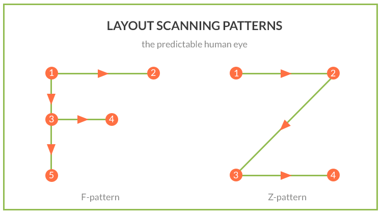
- Use F-pattern and Z-pattern layouts for placing key information.
- Use Plenty of Headings: Headings give structure to content, breaking it into smaller, digestible sections.
- Keep Headings Close to Their Sections: Headings should be placed closer to the content they introduce than the previous section, making it immediately clear where each new section begins.
- Break Paragraphs Every Few Sentences: Short paragraphs make reading less daunting and easier to scan, especially on mobile devices where screen space is limited.
Choosing the First Reasonable Option
- Place the most popular options at the top of dropdowns or lists.
- Use default selections for commonly chosen options (e.g., “Standard Shipping”).
- Logical and Consistent Flow: Ensure the flow of actions makes sense. Each click should be a natural next step, whether it’s filling out a form, navigating to a product page, or finalizing a purchase.
Shouting
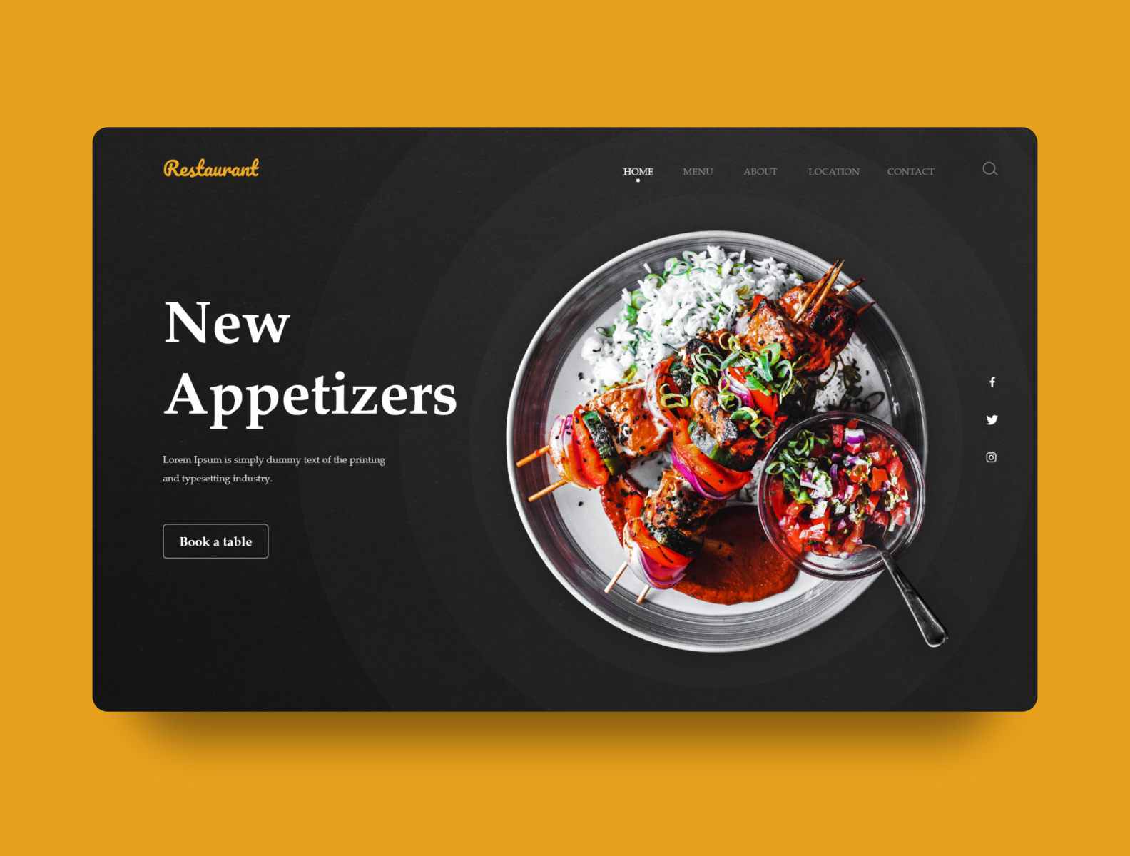
- When every element on a page is designed to stand out, nothing actually does. Avoid overusing bold colors, large fonts, or other attention-grabbing styles for every piece of information. Instead, prioritize the most important elements, allowing them to stand out and guiding the user’s attention without overwhelming them.

Users in a Hurry
- Include autofill options for forms and pre-filled data where possible.
- Provide quick links or “jump-to” buttons for longer content.
- Pre-fill Forms: If you can, pre-fill form fields or allow users to autofill to save time.
- Clear Call-to-Actions (CTAs): Place action buttons like “Continue,” “Submit,” or “Buy Now” in visible spots, and make sure they stand out without competing with other elements on the page.
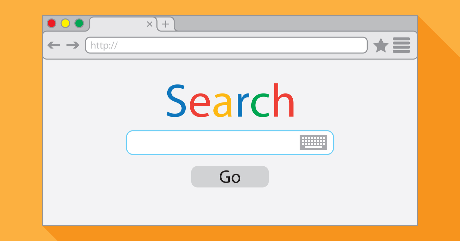
- Instant Results: Where possible, provide instant results or feedback. For example, if a user submits a search query, show results immediately rather than waiting for page loads.

Users Muddle Through
- Include a robust search feature with autocorrect and autocomplete.
- Limit Choices and Minimize Distractions: Reduce unnecessary options, especially on high-traffic pages.
- Help Users Quickly Correct Mistakes:
- Undo Buttons: Especially in forms or checkout processes, allow users to change their input easily.
- Clear Error Messages: If a user makes a mistake, let them know right away in plain language, along with guidance on how to fix it.
Key User Questions and Solutions
When a user first enters your website they will automatically ask a few different questions to themselves in order to achieve their goal, some of these questions are:
What is this?
The first question users will have when they land on your site is: What is this website about?
- Clear Tagline or Heading: At the top of the page, display a concise and straightforward tagline or heading that communicates the core purpose of the site. This could be something like “Shop Eco-Friendly Home Goods” or “Stream Movies and TV Shows”.
- Brand Identity: Incorporate branding elements like your logo and a visual style that reflects the personality of your website, whether it’s professional, playful, or creative. This visual cue will help reinforce the purpose of your site.
- Mission Statement (Optional): If your business has a mission or vision that differentiates you from others, consider including it in a brief statement that further explains what your site offers. For example, “Our goal is to make shopping for sustainable products easier”.

What can I do here?
Once users know what your site is, the next question is: What can I do here?
- Call-to-Actions (CTAs): Offer clear CTAs that guide users to their next steps, whether that’s making a purchase, browsing products, signing up for a newsletter, or contacting customer support.
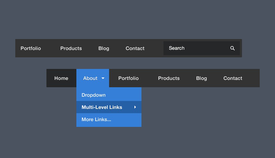
- Navigation Menu: Provide an intuitive and easy-to-use navigation bar that outlines the main actions users can take on your site. For example, “Shop Now,” “Browse Categories,” or “Join Our Community”.
- Featured Content or Services: Highlight what the site offers upfront. For example, you might show a featured product category, top services, or key offerings right below the fold. This shows users what they can explore or engage with immediately.
What do they have here?
After establishing what users can do, the next question is: What exactly does the site have?
- Showcase Products/Services: Display a snapshot of what you’re offering. If you sell products, feature a few best sellers or new arrivals. If you provide services, list the key services you offer. Use visuals (product images, service icons, etc.) to showcase the range of your offerings.
- Content: If your site is content-focused, show what kind of content visitors will find (e.g., blogs, articles, videos, etc.). This gives users an immediate sense of the value your site provides.
- Dynamic Content: Depending on your site’s focus, show live data or dynamically updated content (e.g., current promotions, trending products, or recent blog posts). This keeps the homepage fresh and relevant.

Why should I be here and not somewhere else?
The final question users will ask is: Why should I spend time on this site instead of going elsewhere?
- Differentiation: Highlight what makes your website unique. If you offer unique products, services, or experiences that competitors don’t, make this clear. For example, “Free shipping on all orders”, “Expert customer support 24/7”, or “Sustainably sourced materials”.
- Trust Signals: Show testimonials, reviews, or partnerships with well-known brands to build trust and credibility. Social proof plays a big role in convincing visitors they’re in the right place.
- Value Proposition: Ensure that your value proposition is immediately clear. Why should users choose your site over others? Whether it’s better prices, faster shipping, or exclusive content, this is the key factor that convinces users to stay on your site.
- Sense of Urgency: Create a sense of urgency with things like limited-time offers, limited stock, or exclusive access. This encourages users to engage right away, knowing that they might miss out elsewhere.

Key Points to Avoid the Tragedy of the Commons on Your Homepage
The homepage must be carefully curated to optimize attention without overwhelming visitors with too many competing elements. If a homepage tries to serve everyone and include everything (ads, too many CTAs, excessive links, flashy banners, irrelevant info), it risks distracting or frustrating users, much like a shared resource that becomes depleted or degraded from overuse.
- Avoid Information Overload:
- Keep the homepage focused. The goal is to give users a clear understanding of what your site offers and provide them with clear next steps without overwhelming them with too many options or distractions.
- Prioritize User Needs:
- Identify core user needs and focus on those. Every additional feature or section on the homepage is like adding more pressure to a shared resource—making it harder for users to find what they need.
- Balance User Engagement:
- Use the limited space wisely. Prioritize the most important actions or information and make it prominent. Too many calls-to-action (CTAs), options, or flashy elements can cause users to feel like they have to decide between too many choices rather than being directed toward one clear path.
Enhanced Design Tips
How a website looks is equally as important as how the website functions, a good looking website draws people in and a well working website makes them stay. Below are some key visual concepts to help you better understand visual design principles:
Visual Hierarchy
- Use shadowing or layering effects to separate overlapping sections.
- Prioritize actionable elements (e.g., “Sign Up” buttons) with animation on hover.
- More Important = More Prominent:
- Key information should be visually prioritized so users recognize it immediately. You can emphasize important content by adjusting its:
- Size: Larger fonts or icons naturally draw attention.
- Color: Use bold, contrasting colors for critical elements like calls to action (e.g., a bright button for “Sign Up”).
- Position: Place essential information higher up on the page or in areas where the eye is naturally drawn, such as the center or top-left.
- Related Logically = Related Visually
- Use Lists for Related Items: Lists make it easy to scan related pieces of information quickly. For instance, a list of product features or frequently asked questions can keep related information grouped and easy to understand.
- Consistent Colors and Styles: If two sections are related, use matching or complementary colors to signal this connection.
- Proximity: Placing related items close together reinforces their relationship and makes scanning easier.

Avoid Subtle Cues
- Be Direct and Clear: If a link or button title suggests action (e.g., “Download Your Report”), make it very clear what will happen. Avoid indirect wording like “More Info”, which can mean anything and might not help users figure out what they will get by clicking.
- Avoid Overly Clever Names: While creativity is important, it’s better to be explicit. Phrases like “Our Story” or “Get the Scoop” might sound fun, but they don’t clearly communicate the content. Instead, use “About Us” or “Our History”, which immediately tell users what the page is about.
- Standardized Terminology: Use standard web conventions for common actions. For example, instead of using a custom phrase like “Join the Tribe” for a sign-up link, simply say “Sign Up”. This ensures that users instantly know the action they’ll take.
Navigation and Page Naming
- Use breadcrumbs with clickable links for multi-level navigation.
- Test labels with diverse audiences to ensure clarity across demographics.
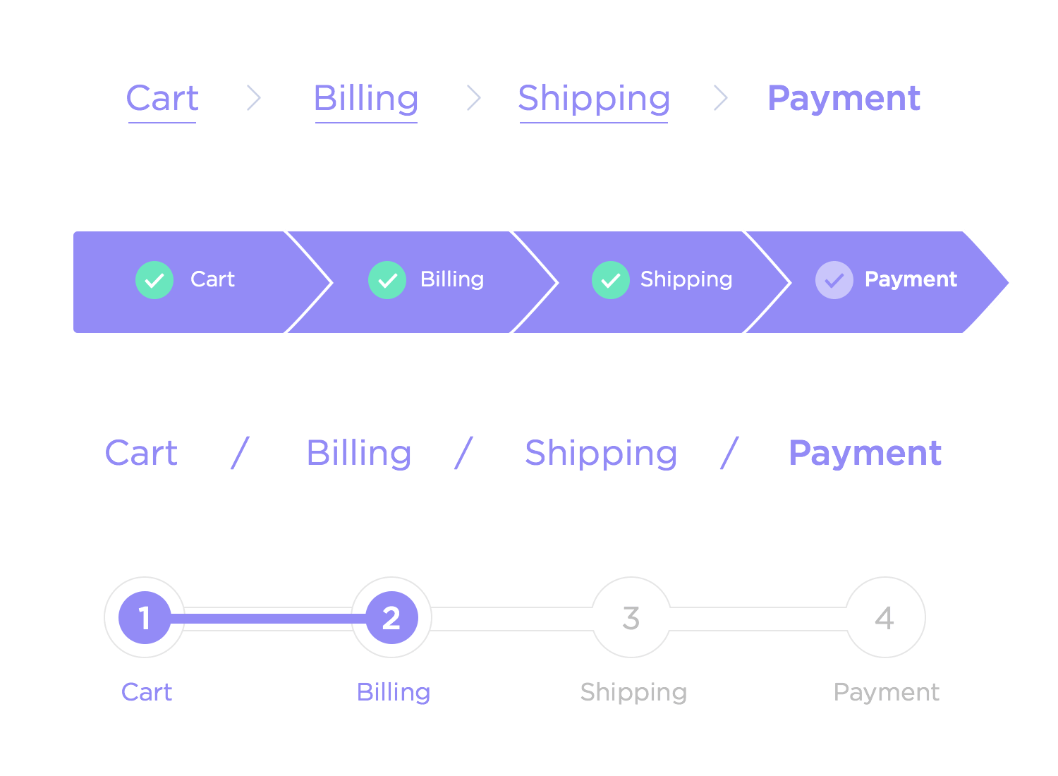
Breadcrumbs are a navigation aid that help users understand their location within a website’s structure and easily navigate back to previous sections. They provide a simple and intuitive way for users to track where they are in relation to the site’s hierarchy. Here’s how to implement effective breadcrumbs:
For an e-commerce website, if a user is browsing noise-canceling headphones under the “Electronics” category, an ideal breadcrumb trail might look like:
- Home > Electronics > Headphones > Noise Cancelling
Here, “Home” is the first level, “Electronics” is the second, “Headphones” is the third, and “Noise Cancelling” is the current, bolded page. - Use icons or separators that match your site’s design language.
- Allow users to click on each breadcrumb level for easy backtracking.
Omit Needless Words
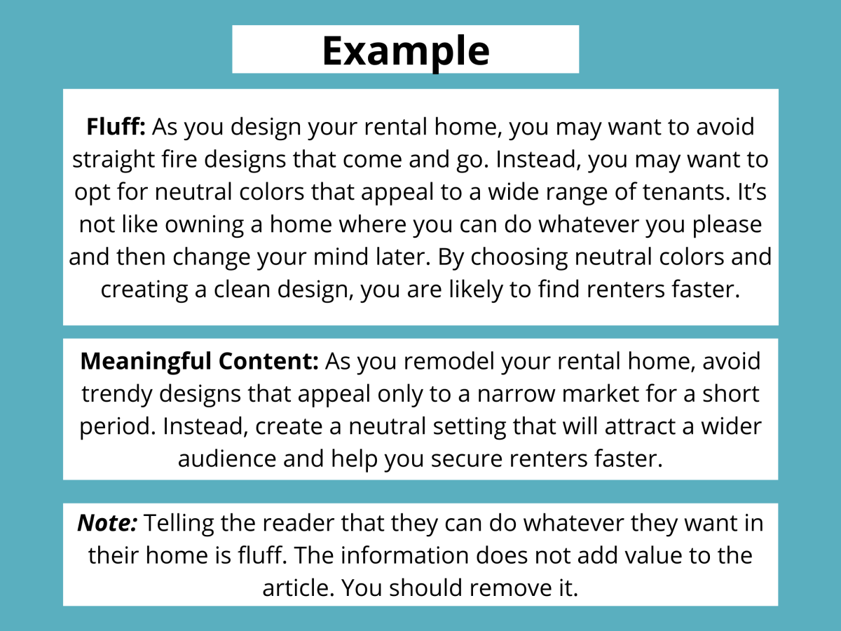
Every word on a page should serve a purpose. Reducing unnecessary language improves clarity, saves time, and makes it easier for users to scan content. Avoid using long-winded explanations or filler text that doesn’t add value to the user’s experience.
- Simplify Sentences: Avoid convoluted language. For example, instead of saying “In order to complete your registration, you will need to provide the necessary information as requested below”, simply say “Complete your registration by filling in the required details.”
- Use Action-Oriented Language: Whenever possible, make the sentence actionable. For instance, “Click here to get started” is more direct and clear than “You can click here to begin your process”.
- Avoid Redundancy: If you’ve already said something clearly, don’t repeat it. For example, don’t say, “Click the button to add the item to your cart. This will add the item to your shopping cart.” One sentence is enough.
Things To Avoid
Small, Low-Contrast Text:
- Why: Small text combined with low contrast can be very hard to read, especially for users with visual impairments or those viewing your site in less-than-ideal conditions (e.g., bright lighting or on mobile devices).
- Recommendation:
- Always ensure that text size is large enough to be legible, especially for body copy. A font size of at least 16px is recommended for body text.
- High-contrast text (e.g., dark text on a light background or light text on a dark background) improves legibility. Avoid light gray text on a white background, as it can be difficult to distinguish.
- If you must use low-contrast text (for stylistic reasons), use larger sizes or bold text to maintain readability.
- Don’t sacrifice readability for aesthetics unless it’s for something like a design portfolio, where you’re showcasing your own work and readability isn’t the primary concern.

Labels Inside Form Fields
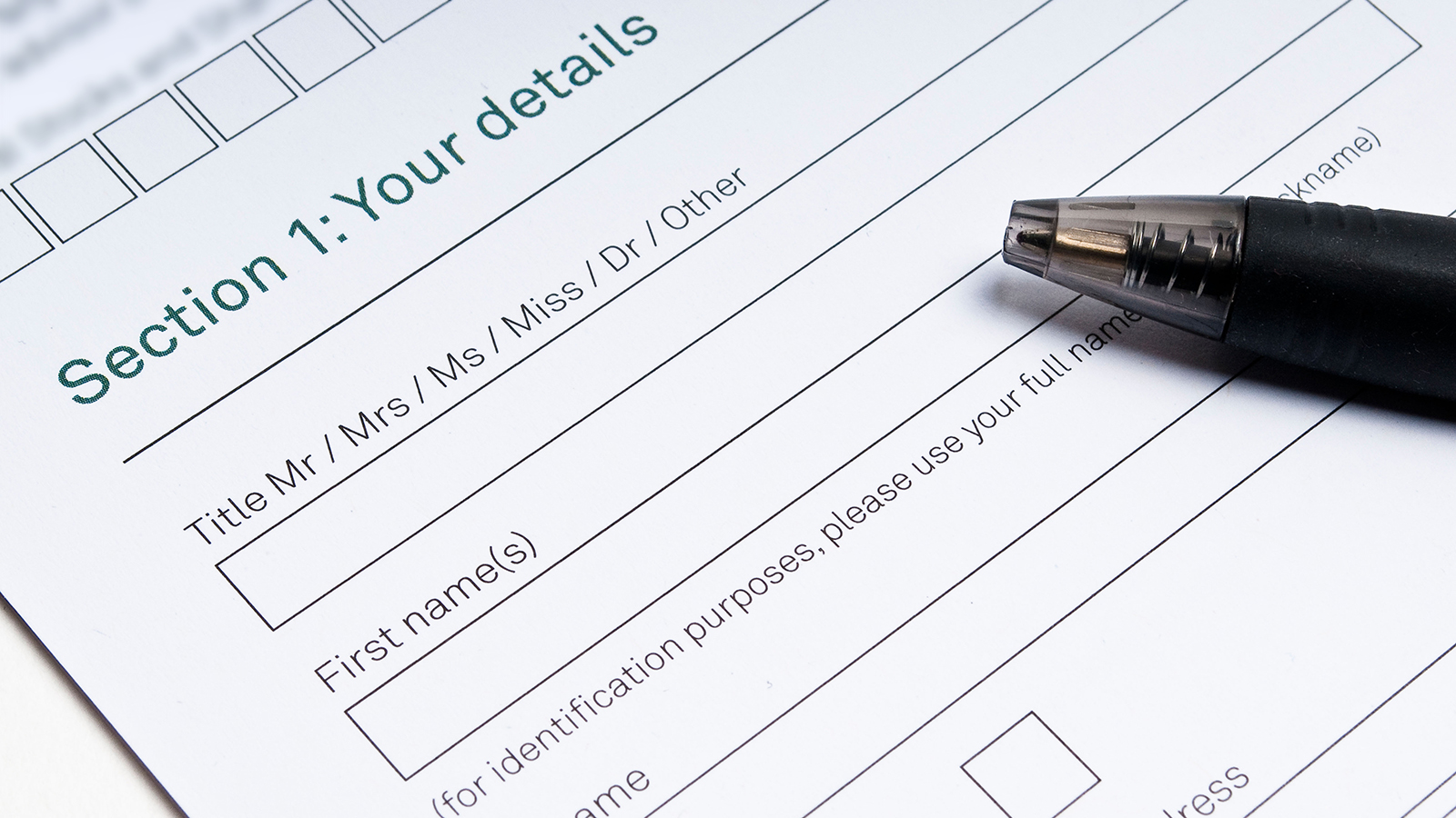
- Why: Putting labels inside form fields (e.g., “Name” inside the “Name” field) can be confusing for users, especially when they start typing. Users may forget what the label was once they’ve entered their information, leading to potential errors or confusion.
- Exceptions: You can use this approach if:
- The form is exceptionally simple (e.g., a one-field sign-up form).
- The label disappears when the user starts typing and reappears if the field is empty (this ensures the label is always accessible when needed).
- Labels are never confused with answers, and the form is fully accessible.
- Recommendation: Always place labels outside the form fields and ensure that they are visible even after the user begins typing. This is especially important for longer or more complex forms.
Undistinguishable Links
- Why: Visited links are a helpful visual cue that lets users know where they’ve already been on the site. This reduces the cognitive load of trying to remember which links they’ve clicked on and helps prevent them from clicking on the same link multiple times.
- Recommendation:
- Ensure that your link colors change after they’ve been visited. This is typically handled by browsers automatically, but ensure that the color is distinguishable enough for the user.
- Make sure the visited link is easily distinguishable from unvisited links, either by color, underline, or bolding.
- This is particularly useful for navigation menus, so users can clearly see where they are within the site.

Floating Headings
- Why: Headings are essential for scannability and help users quickly locate the section they’re looking for. When headings float between paragraphs, it disrupts the logical flow of content and can confuse users as to which section the heading refers to.
- Recommendation: Always ensure that headings are placed directly before the content they introduce. Headings should not be buried between paragraphs of text, as this makes the structure harder to follow.
- Place headings immediately before the content or paragraph they are meant to introduce.
- This structure helps with both scannability and accessibility, as screen readers can more easily identify headings and navigate content accordingly.
Conclusion
In today’s digital landscape, creating a seamless and engaging user interface (UI) and user experience (UX) is essential for any website’s success. By adhering to simple design principles like the K.I.S.S philosophy, websites can reduce cognitive load, improve navigation, and focus on core goals to enhance usability and guide users toward their objectives without unnecessary distractions. Understanding how users interact with content—such as their scanning habits, decision-making processes, and need for speed—allows designers to prioritize clarity, consistency, and efficiency.
Addressing key user questions like “What is this site?”, “What can I do here?”, and “Why should I stay?” through intuitive navigation, strong branding, and unique value propositions builds trust and sets a website apart from competitors. Enhanced visual design techniques, including visual hierarchy, clear calls-to-action, and optimized typography, ensure a professional and accessible look while avoiding common pitfalls like low-contrast text and floating headings. By balancing aesthetics with functionality and prioritizing simplicity and user needs, businesses can create websites that not only attract visitors but keep them engaged for long-term success.
